
Effective Data Visualization
- Sep 17, 2024
- 2 min read
Data visualization is the graphical representation of information and data. By using visual elements like charts, graphs, and maps, data visualization tools make complex data more accessible, understandable, and usable. It enables businesses and analysts to identify patterns, trends, and outliers in large datasets quickly, making it an essential skill in today’s data-driven world.
Effective data visualization transforms raw numbers into insightful, digestible graphics that enhance decision-making. When properly implemented, it allows stakeholders to grasp information at a glance, compare different data points, and draw meaningful conclusions.

How to Properly Visualize Data?
Proper data visualization follows a structured approach to ensure that the insights conveyed are clear and effective. Here are key principles to follow:
Understand Your Audience – Tailor your visualizations to match the level of expertise and interest of your audience. Decision-makers may prefer high-level summaries, while analysts might need detailed visual breakdowns.
Choose the Right Chart Type – Different data types require specific visual representations for clarity and accuracy.
Keep It Simple and Focused – Avoid clutter and unnecessary design elements that may distract from the main message.
Use Consistent Colors and Labels – Ensure that the colors used convey meaning and remain consistent across different charts.
Highlight Key Insights – Use annotations, color emphasis, or trendlines to guide viewers toward the most important information.
Ensure Accuracy and Integrity – Avoid misleading representations by using proper scaling, correct data points, and avoiding exaggerated effects.
Proper Visualization for Different Data Types
Different data types require specific visualization techniques to ensure clarity and insightfulness. Below are common data types and their best-suited visualization formats:
Categorical Data
These are product categories, brands, or customer segments.
Best visualized using bar charts or pie charts.
Example:
Bar Chart - showing sales per product category and region.

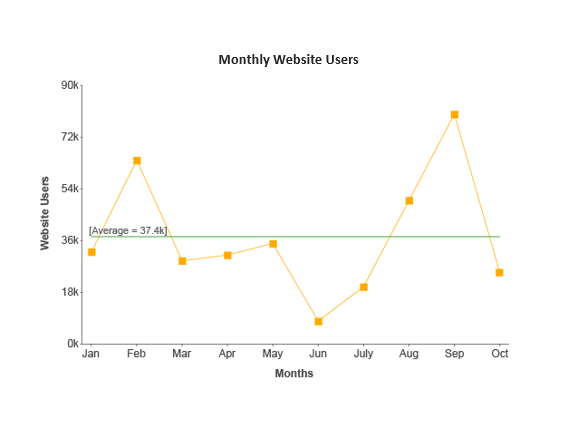
Time Series Data
These are sales trends over time, stock prices, etc.
Best visualized using line charts.
Example:
Line Chart - monthly website users with superimposed average level.
Text Data
These are online text data, surveys, opinion polls, etc.
Best visualized using wordcloud.
Example:
Wordcloud - used wordcloud in analyzing the customer reviews on rented attires.

Popular Data Visualization Tools
There are a lot of data visualization tools that can be used. Below are some of the most commonly used tools in creating data visualizations.
Excel
Power BI
Tableau
R
Python


Comments